Eurofighter Website
Client
Eurofighter
Role
Design Lead
UI Designer
Branding
Overview
Eurofighter is Europe’s largest military collaborative programme. Its flagship product is the Eurofighter Typhoon, one of the world’s most advanced swing-role combat aircrafts. Eurofighter operates in a niche, yet highly competitive industry.
Goal
To build a new website that merges Eurofighter.com and Eurofighter World into a single, streamlined responsive website that tells a visual story that promotes the Eurofighter Typhoon's cutting edge development to prospective clients and enthusiasts.
Project Goals
1
1
Create a new Design System that is up to modern UI standards and is Componentised for easy content creation.
2
2
Present key information in visually engaging ways to increase awareness of the aircraft’s quality and features.
3
Reflect the cinematic essence of the Eurofighter Experience Center in a responsive website.
4
Refresh and evolve the website's brand image with "cutting edge" visual design and story telling.
Animated Experience
Animated Experience
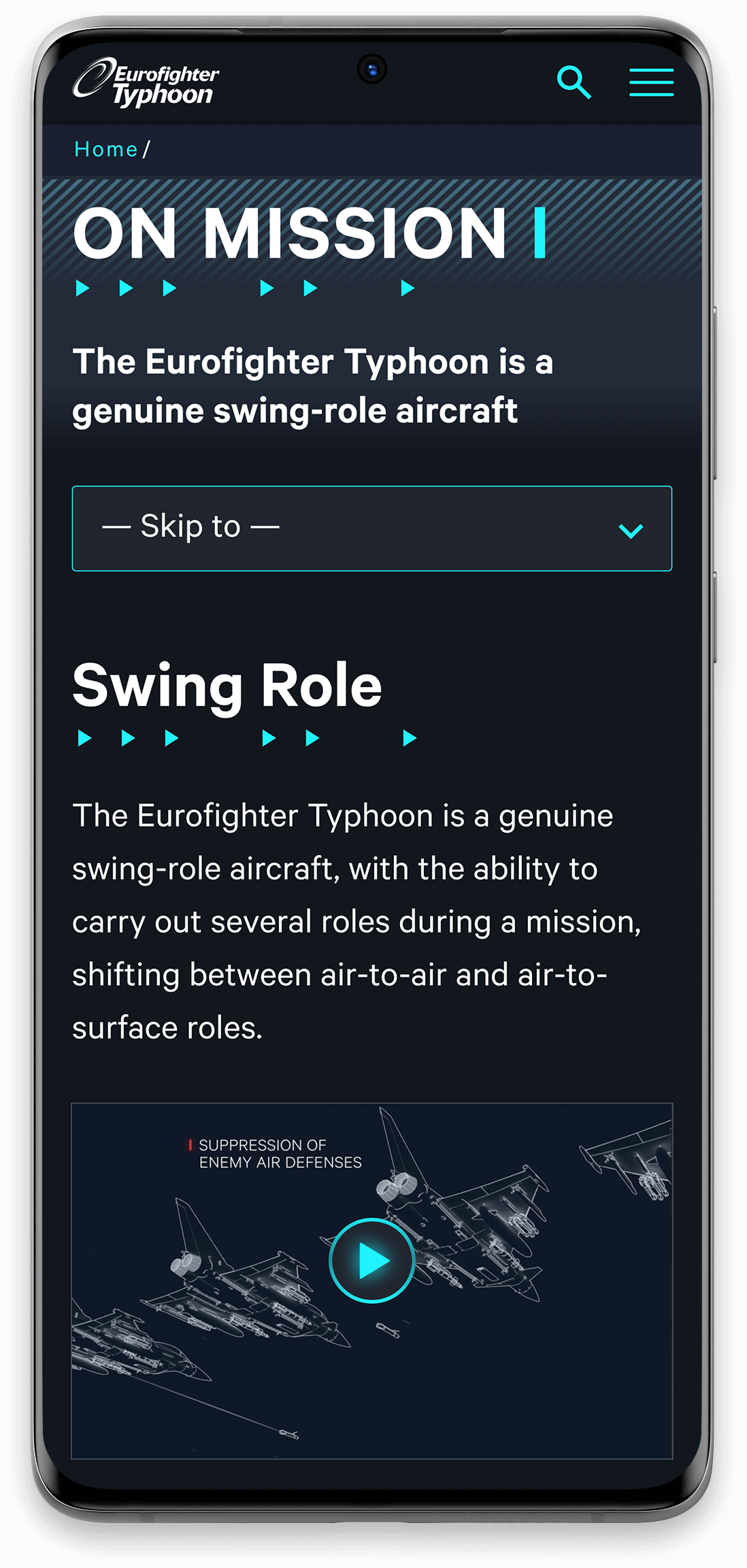
The client established that they wanted their flagship product to take center stage and show off it's features by using existing 3D animation and statistics. The Features page is an example of this, bringing to life the dynamics of a super sonic fighter jet.
I designed all of the UI and how it interacts with the on-scroll aircraft animation. I storyboarded the aircraft from angle to angle, helping the 3rd party animation studio "Schwarzbild" with the 3D render.
Design Brief
Evolve The Brand
I worked with the client to evolve Eurofighter's; colour palette, graphic devices, typography styles and infographics to reflect the latest innovations of the aircraft. The agreed Brand Direction was to design a cinematic web experience that utilised a dark aesthetic and styling from the cockpit of the aircraft. Reflecting the essence of the aircraft and the Experience Center.
Visual Storytelling
I utilised existing video footage and 3D animations and technically directed how these animated pages should work on the page, demonstrating the aircrafts technical capabilities. This sets the tone and frames video footage into a story, resulting in extending the cinematic feeling of the Munich Experience Center. The physical Experience Center is like an installation space where you can interact with touch screens and view the aircraft and it's features on big cinematic screens.
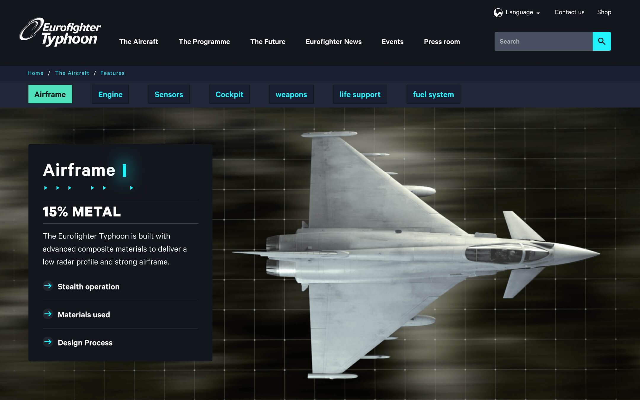
Frame by frame animation of Features page
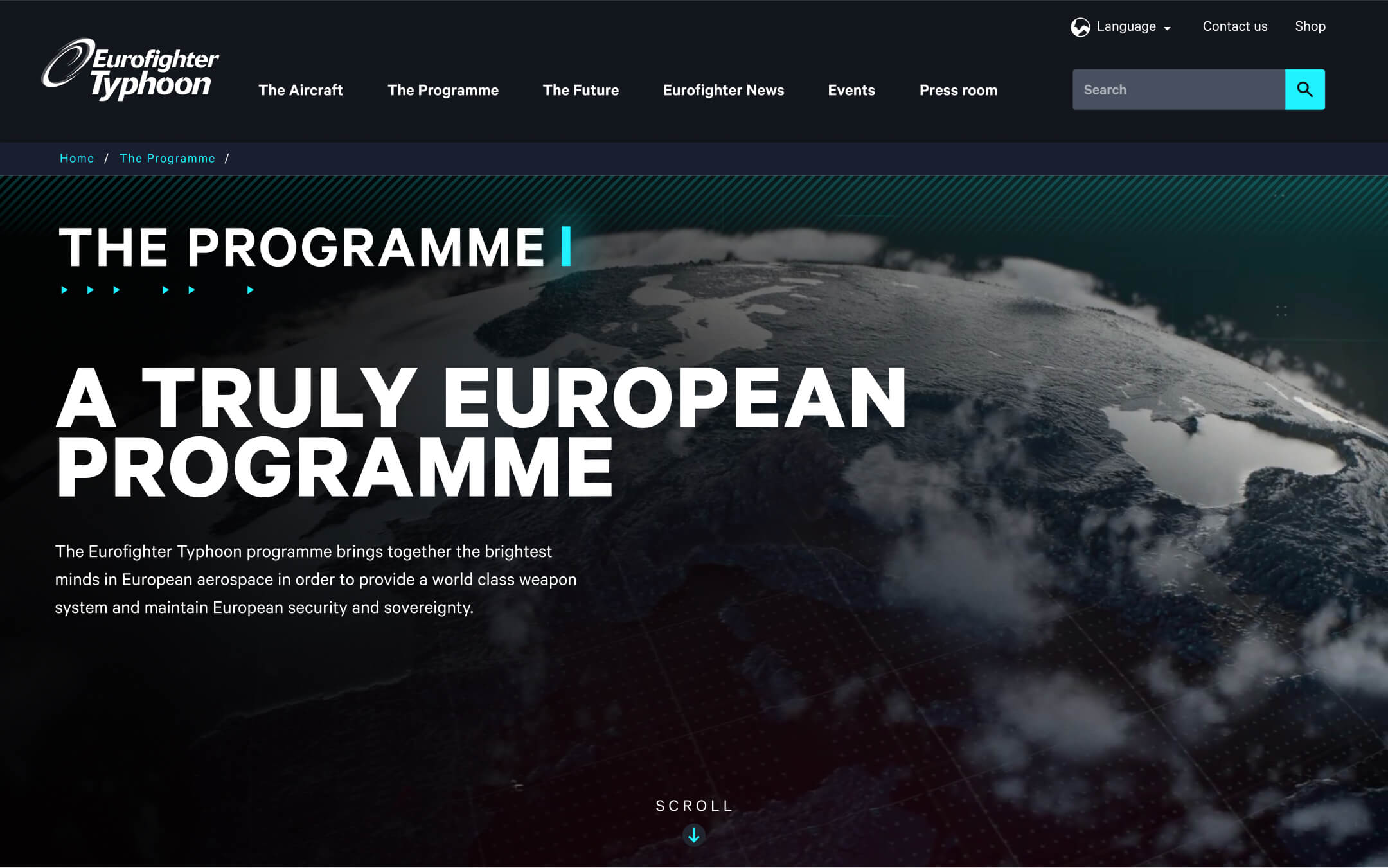
Animated Infographics of The Programme page
Mobile Design
Mobile Design
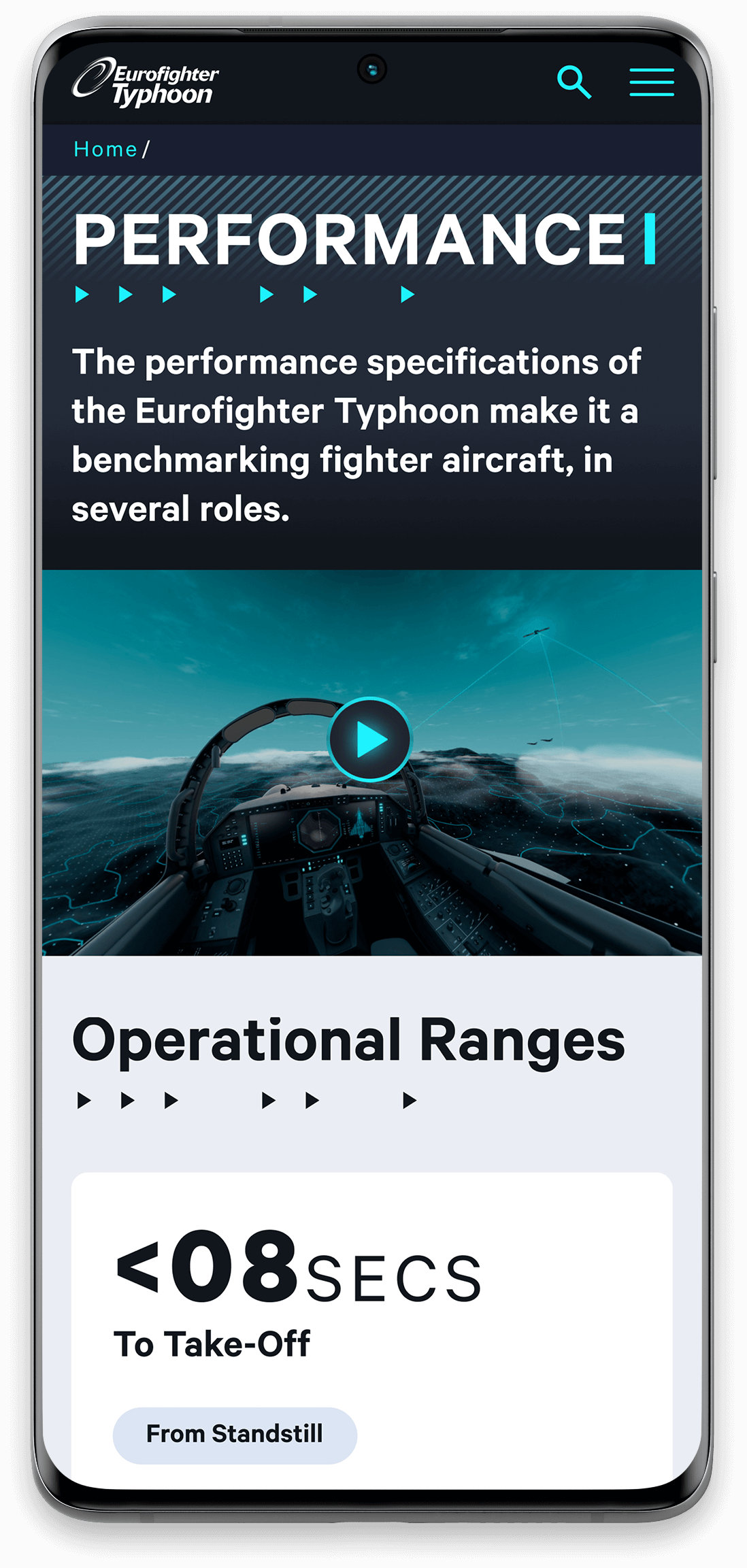
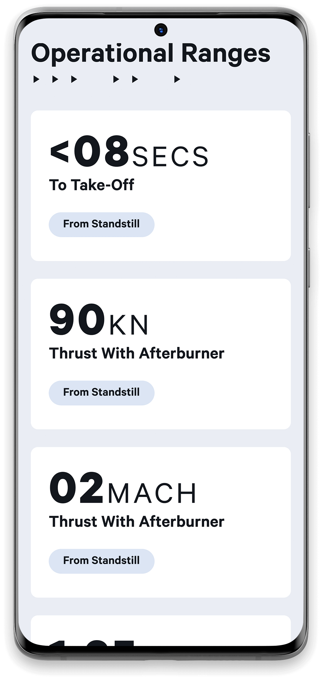
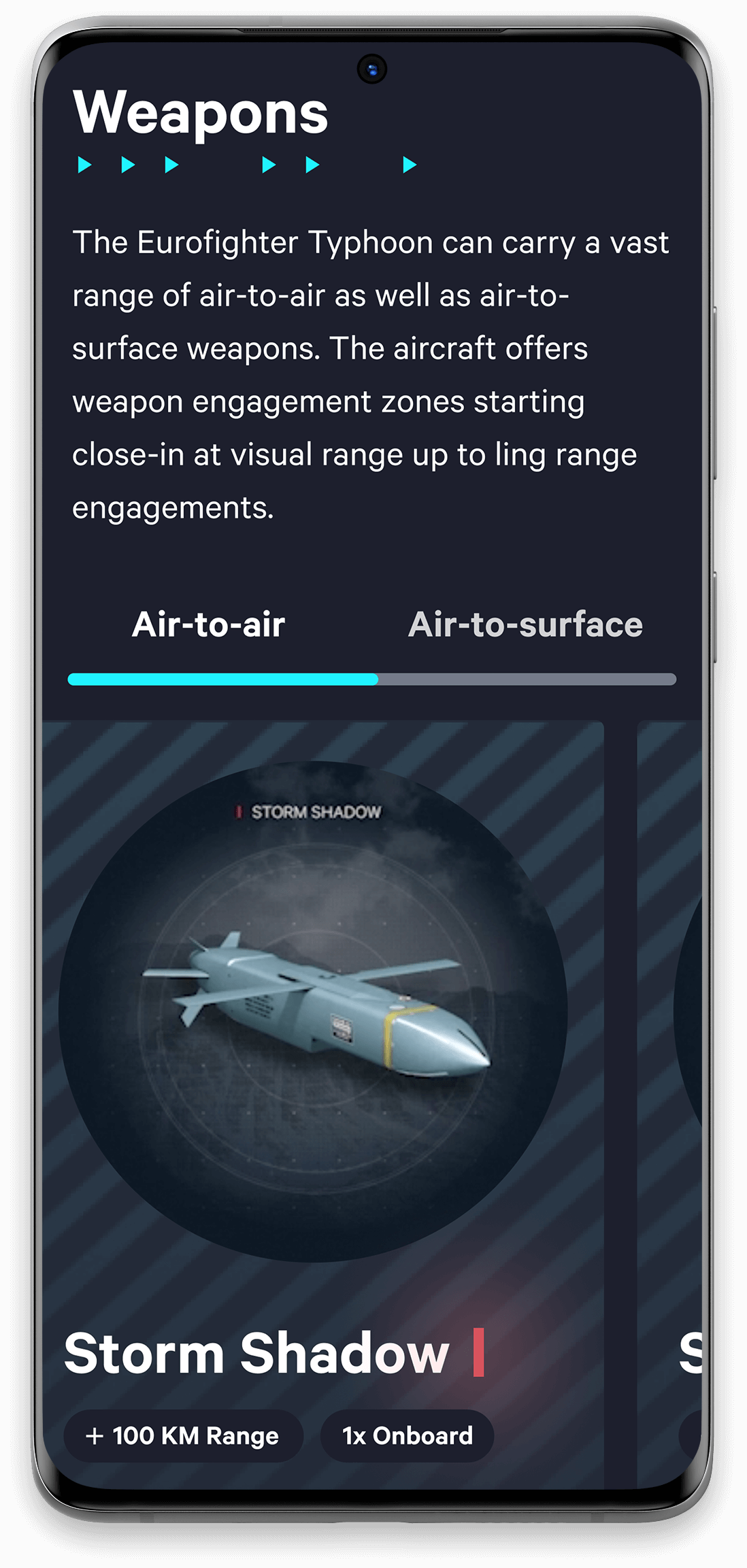
The mobile responds by stacking the content underneath each other. Every component has been designed so it can respond easily to different breakpoints and mobile devices.
I retained as much rich content as possible to keep it as close to the desktop version. However, with the heavily animated pages such as the Features page, we made the decision to keep it static. This is so the performance does not drop on less powerful devices and does not impact the legibilty of core content.
Creating these Animations helped me understand how the content could interact with the styling & minimal web design.
Creating these Animations helped me understand how the content could interact with the styling & minimal web design.
Creating these Animations helped me understand how the content could interact with the styling & minimal web design.
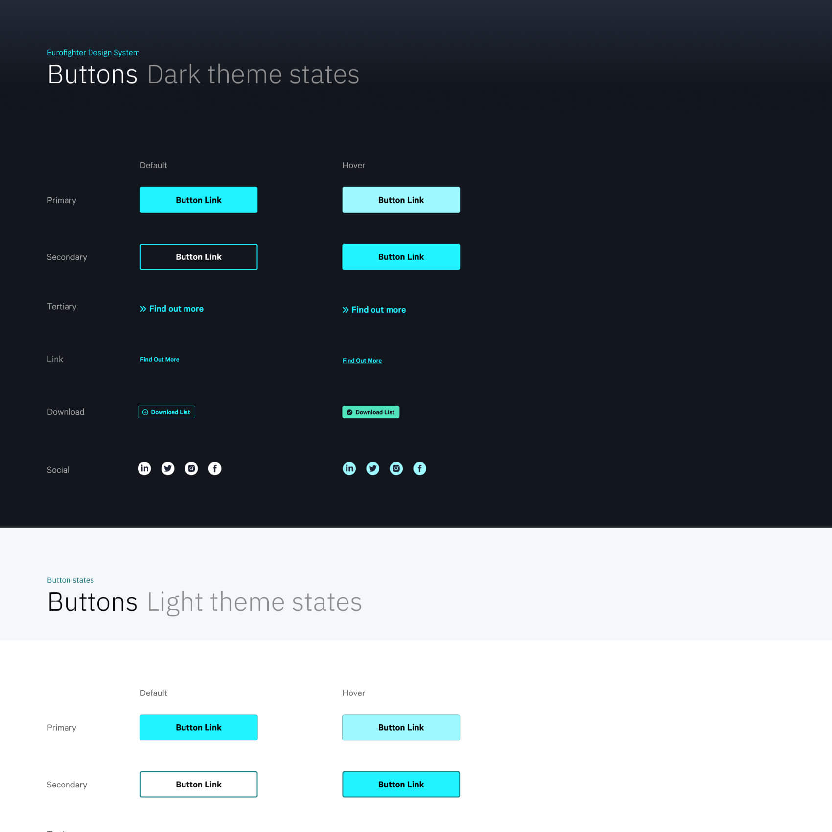
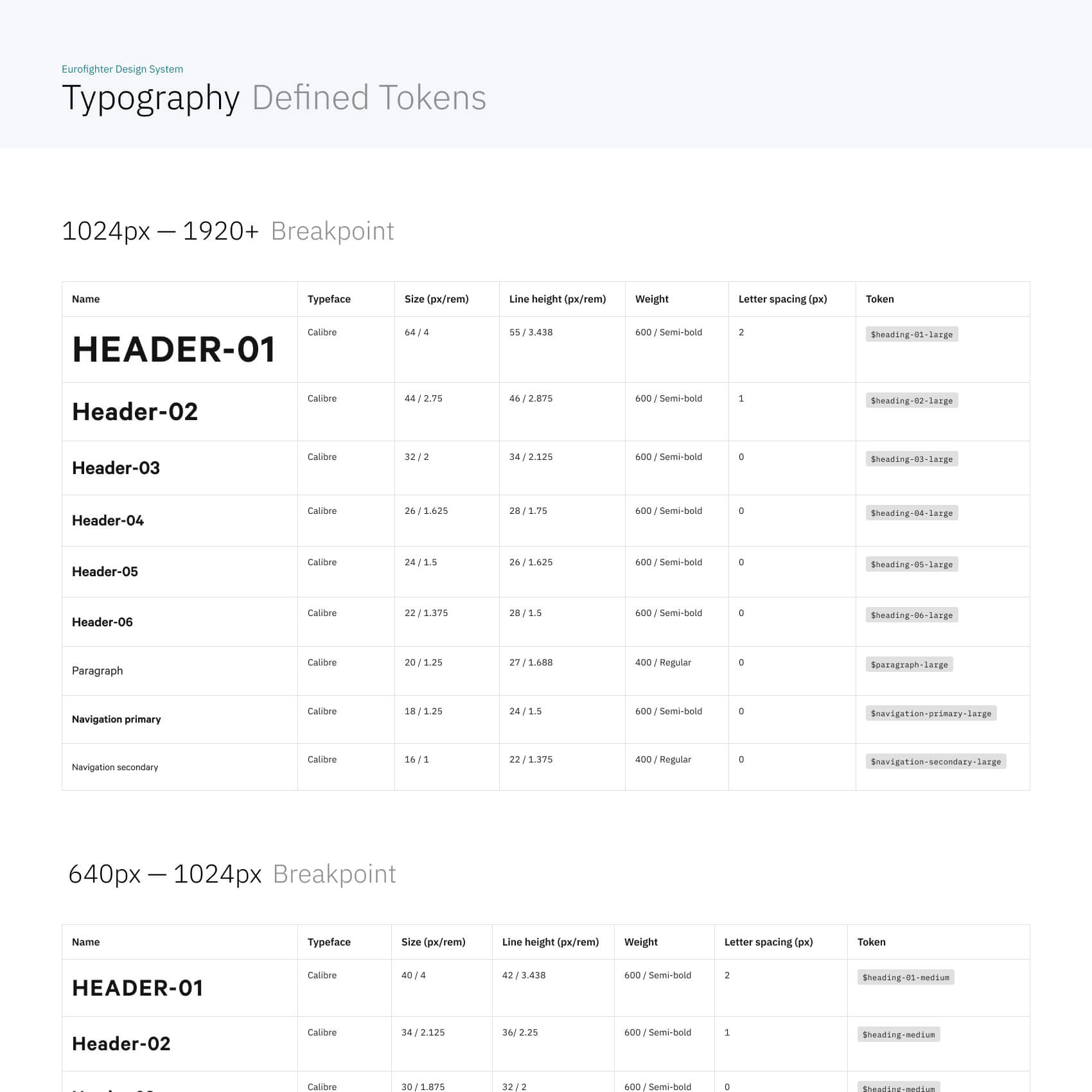
Design System Foundation
As the website grows so will the amount of content creators. By including a limited amount of curated colours, header styles and blocks means it is easier to keep the design consistent when new web pages are created over time. Too much choice can lead to inconsistent brand design and will typically make a website or digital product inconsitant and confusing to use.
UI elements are organised in a Figma design system. This helps developers and content creators to maintain a consistant UI pattern and brand identity. Utilising a Figma library keeps a centralised system that is easier to maintain and update by another designer beyond the initial product launch.
Creating these Animations helped me understand how the content could interact with the styling & minimal web design.
Creating these Animations helped me understand how the content could interact with the styling & minimal web design.
Creating these Animations helped me understand how the content could interact with the styling & minimal web design.
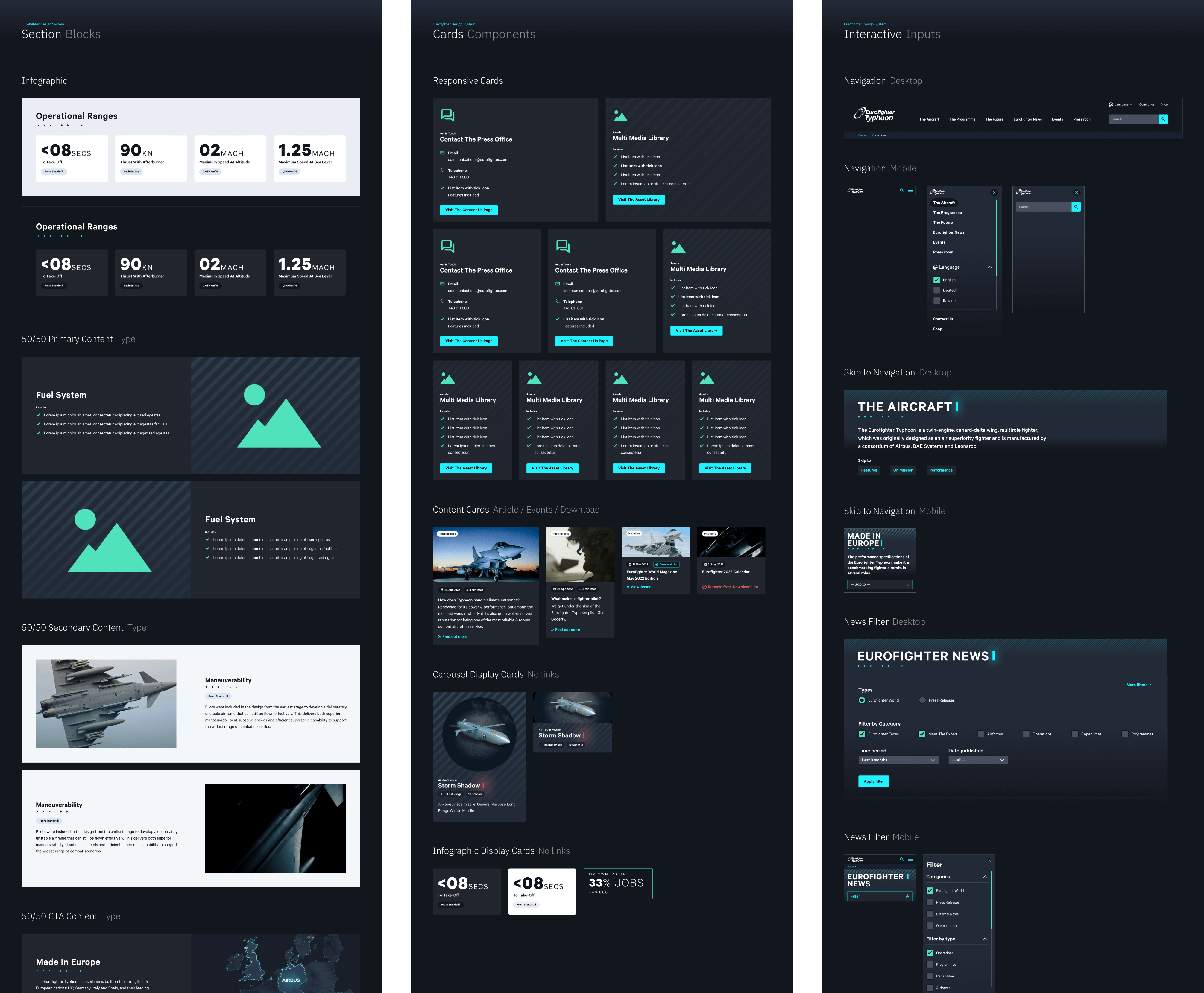
Atomic Design
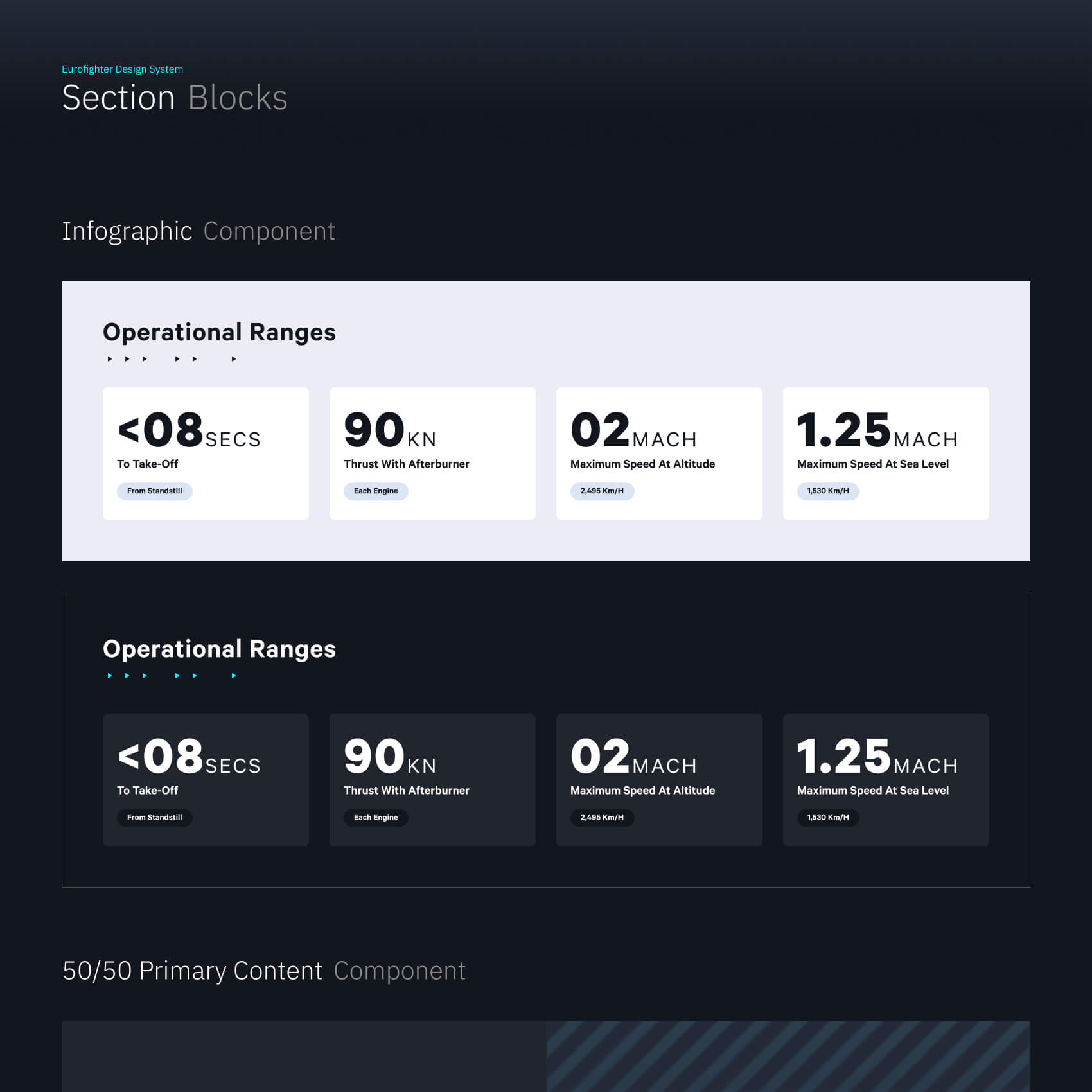
Every component is created with reusable styles to maintain the same technical measurements and styling, this includes: spacing, colours, typography scales, icons, chips, buttons, cards and interface controls. This bottom up structure means that every component and section in the website is consistant as they are built from a shared Figma library of pre-defined tokens. In short the design system is highly interchangable and gives the ability to create new components using existing atoms and molecules.
Componentised Design System
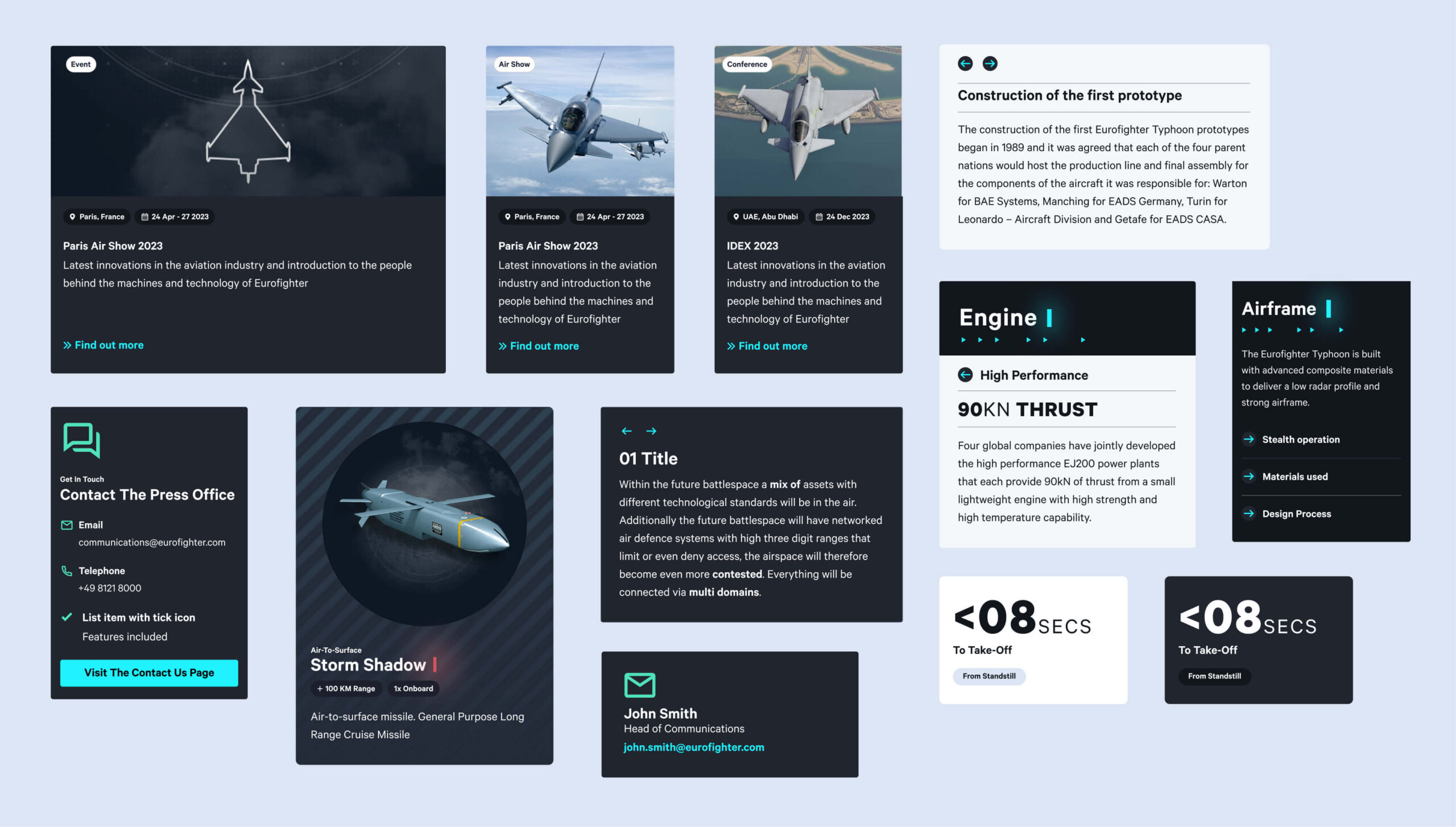
Each component can be combined to create new page layouts, to tell a story through: infographics, video and photography. Certain components like the 50/50 (image + text) have different orientations and an additional colour scheme. This helps the content look balanced and gives the ability to highlight key information the content editor wants the user to focus on.
Accessibility
Keyboard Controls
Tabbing order is fully implemented for visually impaired users and helps navigation when using screen readers.
Input Validation
Forms have clear error messaging and a bright colour coding system to give visual feedback.
Considerations
Animated pages have legible content boxes for text. Scroll controls can slow the animation and pause it for nuerodiverse people.
Colour Contrast
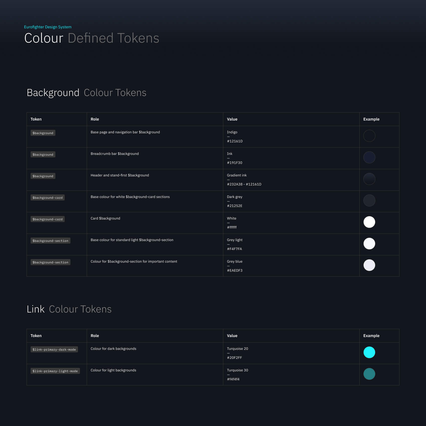
All typography has Triple A contrast due to high contrast of the overal background colours to maximise legibility.
Pacing Content with Colour Variation
Both light and dark mode variations for cards, sections and components were implemented. This gives greater flexibility in placing content on pages ensuring optimal contrast levels between sections in the layout and variation in the UI design. This means a content page can have a varied "pacing" to estabish differences or commonalities to the content. This gives a content designer the power to pull-out important information like infographics and bring attention to statistics.
Component Library
After the content audit of the original site was made, discussion with the client ensued over what types of information was important to publish. I worked with UX to identify how we can present this information. I created a system of cards that can be adapted to suit different content types such as: infographics, news, downloadable items and key features.
Creating these Animations helped me understand how the content could interact with the styling & minimal web design.
Creating these Animations helped me understand how the content could interact with the styling & minimal web design.
Creating these Animations helped me understand how the content could interact with the styling & minimal web design.
A friendly Design System for CMS Editors
A friendly Design System for CMS Editors
From auditing Eurofighter's content and primary purpose, a lean design system was created making sure every UI elements including: components, grid systems, spacing scale, typography scales and colour systems are all functionaly consistant and cohesive to the brand identity. This gives opportunity to future teams to scale up the website and use as a template to create more digital products in the future.
Creating these Animations helped me understand how the content could interact with the styling & minimal web design.
Creating these Animations helped me understand how the content could interact with the styling & minimal web design.
Creating these Animations helped me understand how the content could interact with the styling & minimal web design.
Next project